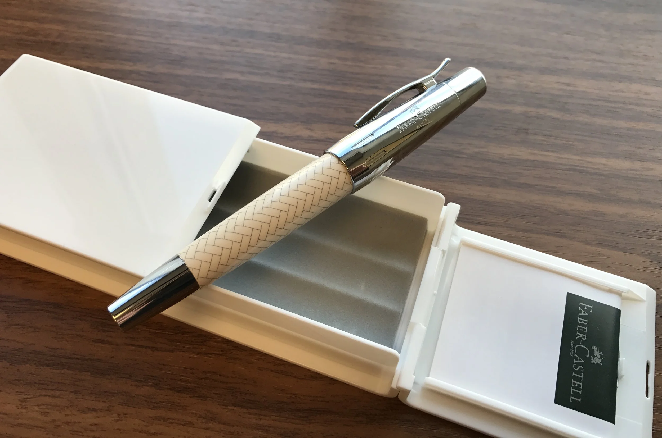
I've developed a thing for German pens, especially those with steel nibs that write as well as gold. It's a sign that the design and manufacturing teams value attention to detail and quality control. Over the past six months, the Otto Hutt Design 06 and the Pelikan M205 Transparent Blue have both made their way into my regular rotation. Now I need to pick up a fountain pen from Faber-Castell.
Faber-Castell's international headquarters is located in Stein, Germany, while Faber-Castell USA is based in Cleveland, Ohio. Most of us in the States know the company for their pencils. Those of us who went to school in the 1980s-1990s might recall the ubiquitous Faber-Castell American pencils (of which I have a massive nostalgia stash). But Faber-Castell also manufactures a line of high-quality fountain pens, as well as a line of more expensive pens (read, $500+) marketed under the name Graf von Faber-Castell. The pen I'm going to review today is the e-motion, from the standard Faber-Castell line, which also includes pens such as the Ambition, the Basic, the Ondoro, and the Loom.
Build/Construction
The Faber-Castell e-motion is not a small pen, but the tapered design makes it feel relatively compact and comfortable to use.
The e-motion has a unique chunky design that some people may resist at first, but it grows on you. Why? Because this pen is extremely comfortable to hold. The wide body and tapered ends allow the pen to sit in your hand quite comfortably. To me, the pen is a touch short to use unposted, though if you have smaller hands I could see how posting this pen might make it feel top-heavy.
The e-motion sports one of the best spring-loaded clips that I've used.
This particular model of the e-motion features chrome trim and a white resin barrel with a guilloche/herringbone pattern etched into it. Other models of the e-motion combine the chrome trim with various woods, and there's even a blacked-out version for all you stealth pen fanatics.
Chrome cap with Faber-Castell branding
The Nib and Writing Experience
The broad nib on this pen is exceptional - there's really no other way to describe it. However, Faber-Castell's broads (or "bolds" as some people like to call them) are too wide for me. At one point I owned a Faber-Castell Ambition with a broad nib, but ended up passing that pen along to my friend Bob over at My Pen Needs Ink. These nibs are indeed quite broad and very wet, which aren't the best for my handwriting style. When I eventually add a Faber-Castell to my collection, I will need to go with a medium or a fine.
Faber-Castell steel nibs are made by either Bock or JoWo - I've heard conflicting reports. Either way, they are excellent writers.
In terms of smoothness, though, this pen is unmatched, straight out of the box and unmodified. Ink flow, while heavy, has been consistent without any skips or hard starts. I'm often asked why people should be willing to spend the extra money and pay north of $100 for a pen with a steel nib. This is your answer. Every Faber-Castell pen I have tried has been tuned to near-perfection. This pen writes every bit as well as any gold nib I have used, and better than most. While you may spend more up front, you won't have to shell out for nib tuning later (unless, of course, you want to turn the pen into a stub, italic, etc.).
As you might expect, the Faber-Castell broad nib is, well, broad!
A quick note on the ink I used for this review: Anderson pens sent me a bag of samples from the Bookbinders line. Bookbinders is yet another excellent Australian ink brand that has made its way into global retail. The ink featured in this review is the aptly named Eastern Brown Snake. I plan on using these inks more before I write a comprehensive review, but let's say I enjoyed this one!
A close-up of Bookbinder's Eastern Brown Snake
Where to Buy
Thanks to the team at Anderson Pens for loaning me this pen to review. While this particular barrel pattern and color scheme doesn't really do it for me, fortunately Faber-Castell offers a wide variety of different looks, including the E-Motion "Pure Black" edition and Black Pearwood. Pricing on this pen ranges anywhere from $130 for the standard editions to $175 for the Pure Black. That Pure Black is calling my name!
If you'd like to read further on this pen, check out Ian's review over at Pens! Paper! Pencils!, as well as Mary's review at From the Pen Cup.
Disclaimer: The pen featured in this review was provided to me free of charge by Anderson Pens (on loan) for review purposes.


